
Most bedrooms don't look wrong because of bad taste.
They look wrong because of a handful of specific, repeatable mistakes that almost everyone makes, usually without realizing it.
The furniture is fine. The colors are fine. The bedding is fine.
But something is off and it's hard to put a finger on exactly what.
Nine times out of ten, it's one of the fifteen things on this list. Most of them are fixable without a renovation, a new furniture set, or a significant budget.
Just knowing what to look for is most of the work.
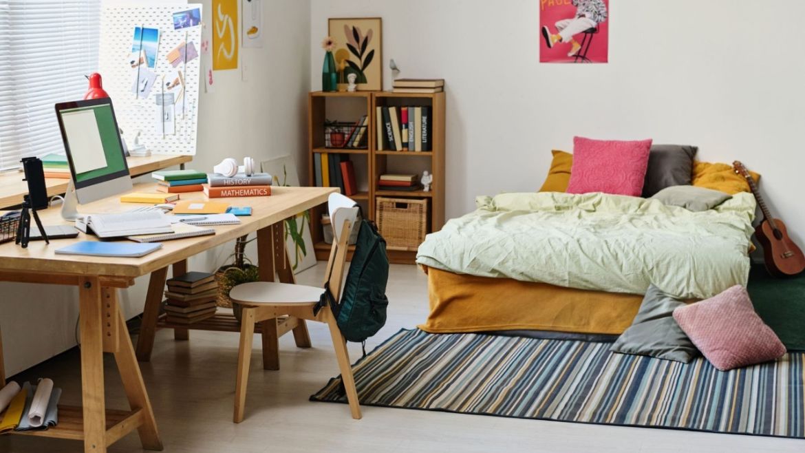
1. Pushing the Bed Into the Corner
This one is so common it's almost the default, especially in smaller bedrooms where it feels like the logical way to save space.
It isn't.
A bed pushed into the corner destroys the room's focal point, makes the bed difficult to make properly, and creates a layout that only really works for one person.
For anyone sharing the bed, one person is climbing over the other every morning.
More importantly, it makes the room feel like a dorm rather than a sanctuary.
The fix:
Center the bed on the main wall, ideally the wall opposite the door, so it's the first thing you see when you walk in.
Leave enough space on both sides to move comfortably. In a small room, even 45 to 60 centimetres on each side is enough to transform how the room feels.
Symmetry, even imperfect symmetry, gives the room a sense of intention that a corner bed simply can't achieve.
2. Buying a Full Matching Furniture Set
Walk into a furniture showroom, fall in love with a display, buy the whole thing.
It makes sense in the moment.
In the room, it looks exactly like what it is, a showroom display that's been moved into a house.
Matching sets have a way of making bedrooms feel like they were decorated in an afternoon and never thought about again.
Every piece has the same finish, the same weight, the same visual language, and the result is a room that feels assembled rather than curated.
The fix:
Mix intentionally.
A bed frame in one wood tone, nightstands in another, a dresser that's a completely different material altogether.
The key is finding a common thread, a shared finish on the hardware, a consistent color palette, a similar visual weight, that makes the mix feel deliberate rather than accidental.
Pieces that look like they were collected over time always read as more sophisticated than pieces that arrived in the same delivery van.
Designer's Note: The most expensive-looking bedrooms are almost never furnished from a single collection. They look collected — like someone bought the bed five years ago, found the nightstand at a flea market, and inherited the dresser. That sense of accumulated intention is what gives a room its personality. You can't buy it in one trip. But you can build it deliberately.
3. Using a Rug That's Too Small
This is possibly the most widespread bedroom design mistake, and one of the easiest to spot once you know what to look for.
A rug that's too small for the bed it's sitting under looks like it was bought for a different room and placed here by accident.
It doesn't anchor the furniture. It doesn't define the space. It just floats in the middle of the room doing very little for anyone.
The fix:
The rug should extend at least 18 to 24 inches beyond each side of the bed.
When you step out of bed in the morning, your feet should land on the rug, not on cold floor.
If the budget doesn't stretch to a larger rug, layer two smaller ones on either side of the bed instead.
It's not a compromise. In the right room it actually looks better than a single large rug.
4. Hanging Curtains at the Window Frame
Curtains hung at the window frame, with the rod sitting just above the glass, do two things, both of them bad.
They make the window look small.
And they make the ceiling look low.
It's one of those details that most people never consciously notice but that affects how a room feels every single time they walk into it.
The fix:
Hang the rod as close to the ceiling as possible, ideally four to six inches above the window frame at minimum, ceiling-mounted if the architecture allows.
Extend the rod four to six inches beyond the window frame on each side so the curtain panels clear the glass completely when open.
The result is a window that looks significantly larger, a ceiling that reads as taller, and a room that feels more considered, all from moving a curtain rod up a few inches.
5. Getting the Lighting Wrong
A single overhead light in the center of the ceiling is the lighting equivalent of a matching furniture set.
It's the default. It's also almost always wrong for a bedroom.
Overhead lighting casts a flat, even light that flattens the room visually and creates exactly the kind of institutional feel that a bedroom should be the opposite of.
The fix:
Layer the lighting from multiple sources at different heights.
A bedside lamp on each nightstand. A floor lamp in the corner. A pendant or wall sconce above the bed if the budget allows.
Multiple light sources at lower heights create warmth, depth, and a quality of light that makes a bedroom feel genuinely inviting rather than just illuminated.
6. Using Cool or Daylight Bulbs
This is the specific mistake inside the general lighting mistake, and it's worth calling out separately because it's so easy to fix and so consistently overlooked.
Cool or daylight bulbs, anything above 4000K on the Kelvin scale, create a blue-white light that's designed to promote alertness and focus.
In a bedroom, that's the opposite of what you need.
It makes the room feel clinical, disrupts the body's natural wind-down process, and makes even a beautifully decorated room feel like a hospital ward after dark.
The fix:
Replace every bulb in the bedroom with a warm white option in the 2700K to 3000K range.
It's a five-minute change that costs almost nothing and immediately makes the room feel warmer, softer, and more like a place to rest.
Designer's Note: Lighting temperature is one of those details that people rarely think about deliberately, but always feel. A bedroom lit with 2700K bulbs from layered sources feels like a completely different room than the same space lit with a single 5000K overhead. Same furniture. Same colors. Same bedding. The light does that much work. If your bedroom never quite feels relaxing despite looking good, start with the bulbs.
7. Too Many Decorative Pillows
Somewhere along the way, the idea took hold that a well-styled bed means as many decorative pillows as possible.
The result is beds that look great in a photoshoot and function terribly in real life.
Every night the pillows come off. Every morning they go back on. Nobody actually enjoys this process and the pillows usually end up on the floor anyway.
More than that, a mountain of decorative pillows in different sizes, shapes, and patterns creates visual noise that makes even a large bed feel cluttered.
The fix:
Edit down to what actually works.
Two sleeping pillows. One or two Euro shams if the bed is large enough. One or two decorative pillows in a complementary color or texture.
That's it.
A few well-chosen, high-quality pillow covers will always look more intentional than a pile of mismatched cushions, and you'll actually enjoy making the bed in the morning.
Shop pillow covers on Wayfair → | Shop on Amazon →
8. Oversizing the Bed for the Room
A king bed in a small bedroom feels like an achievement until you're living with it.
Then it just feels like there's a king bed in a small bedroom and very little else.
When the bed is too large for the space, everything else suffers, there's no room for proper nightstands, no comfortable walking space, no visual breathing room anywhere in the room.
The fix:
Choose the bed size that allows for at least 18 to 36 inches of clearance on each accessible side.
In a smaller room that might mean going from a king to a queen, or from a queen to a full.
A correctly sized bed in a room that still has breathing space will always look and feel better than a bed that fills every available inch.
The room exists around the bed. It shouldn't be consumed by it.
9. Letting the Bedroom Double as an Office
A desk in the corner of the bedroom sounds like a practical solution.
And it is, until you're lying in bed looking at an unfinished project, a pile of work, or a screen that your brain has learned to associate with productivity and stress.
The bedroom is supposed to be the one room in the home where the visual and psychological noise of the day doesn't follow you.
A visible desk and everything that comes with it, the cables, the work, the mental association with tasks, undermines that completely.
The fix:
If the desk has to stay, hide it.
A folding screen or a curtain panel that closes off the workspace corner when the workday ends makes a genuine psychological difference.
A desk tucked into a wardrobe that closes fully is another option.
The goal isn't to remove the desk, it's to remove the visual stress it carries when you're trying to rest.
Out of sight genuinely means out of mind in this particular case.
10. Using Colors That Are Too Bold or Too Saturated
Bright red walls. Electric blue ceilings. Vivid yellow accents.
Bold color in a bedroom sounds exciting, and on a mood board it often looks great.
In practice, highly saturated colors create a visual energy that works against rest.
They stimulate rather than soothe. They demand attention rather than allowing the eye to settle.
A bedroom that's visually stimulating is a bedroom that makes it harder to switch off.
The fix:
This doesn't mean defaulting to beige.
It means choosing colors that have depth without having aggression, muted, desaturated versions of the colors you love.
Deep olive instead of bright green. Dusty blush instead of hot pink. Slate blue instead of cobalt. Warm charcoal instead of jet black.
These colors add personality and mood without the overstimulation that fully saturated versions create.
The bedroom can absolutely have color. It just needs to be the right kind.
Designer's Note: There's a version of bedroom design where everything is scaled perfectly for the room, the bed fits properly, the nightstands are the right height, the rug extends the right distance, and the room just works without you being able to say exactly why. That's the goal. Not any single dramatic statement, but every proportion being right. Get the scale right and the rest of the design decisions become significantly easier.
11. Ignoring the Space Above the Bed
Walk into most bedrooms and the wall above the bed is either completely bare or home to something too small to register from across the room.
A single small print in a thin frame. A tiny clock. Nothing at all.
It's one of the most consistently underused surfaces in the bedroom, and one of the most impactful when used correctly.
A bare wall above the bed makes the room feel unfinished regardless of how considered everything else is.
The fix:
Create a deliberate focal point above the bed.
One large piece of art, properly scaled to the width of the bed, does more for a bedroom than ten smaller pieces scattered around the room.
A striking headboard, a wall-mounted light fixture on either side, or a carefully arranged gallery wall are all valid alternatives.
The rule is the same in every case, one considered moment above the bed, scaled correctly, that gives the eye somewhere intentional to land.
Shop wall art on Wayfair → | Shop on Amazon →
12. Choosing the Wrong Curtain Length
Curtains that hover above the floor are the interior design equivalent of trousers that are slightly too short.
Technically fine. Visually unresolved.
It reads as a mistake rather than a choice, like the curtains were bought in the wrong size and never replaced.
The same applies to curtains that sit at an awkward mid-calf length, not quite touching the floor, not deliberately short enough to look intentional.
The fix:
Curtains should either kiss the floor or pool slightly, an inch of gentle gathering at the base looks deliberately luxurious rather than accidentally long.
Anything in between reads as neither here nor there.
When in doubt, go longer.
Curtains can always be hemmed. The visual impact of a floor-length curtain on a bedroom is worth the effort of getting the length right.
13. Skipping the Bedside Lamp and Reading Under Overhead Light
Reading in bed under overhead lighting is one of those habits that seems fine until you experience the alternative.
Overhead light for reading means bright, flat illumination coming from above, the exact opposite of what the body needs when winding down before sleep.
It also casts unflattering shadows, strains the eyes over time, and makes the room feel utilitarian rather than restful at the end of the day.
The fix:
A proper bedside lamp, ideally adjustable in both height and direction, is one of the most functional and underrated investments in a bedroom.
Wall-mounted reading lights on either side of the bed are an even better option if the nightstand space is limited.
The goal is a warm, directed light source that illuminates the page without flooding the room.
It makes reading more comfortable and the process of winding down genuinely easier.
14. Placing the Dresser Where It Blocks Natural Light
Natural light is the most valuable thing in a bedroom during the day.
It makes the room feel larger, warmer, and more alive, and it costs nothing.
Which makes it all the more frustrating when a poorly placed dresser blocks it entirely.
A large piece of furniture positioned in front of or beside the window interrupts the flow of natural light into the room in a way that no amount of artificial lighting can fully compensate for.
The fix:
Keep the area around the window clear.
Position the dresser on a wall that doesn't compete with the window, opposite the window is often the strongest placement, where it can catch and reflect natural light rather than blocking it.
If the room layout makes this genuinely difficult, a low-profile dresser that sits below the window sill is a workable compromise.
The light matters more than the convenience of the dresser placement.
15. Neglecting the Back of the Bedroom Door
The back of the bedroom door is one of the most consistently wasted surfaces in home design.
It's out of sight when the door is open, which is most of the time, and completely overlooked as a result.
In a bedroom where storage is limited and floor space is at a premium, that's a significant missed opportunity.
The fix:
Put it to work.
A full-length mirror on the back of the bedroom door solves the common problem of nowhere to check a full outfit, without using any floor or wall space.
A set of hooks handles coats, bags, robes, and tomorrow's outfit in a way that keeps them off the floor and out of the wardrobe.
An over-door organizer adds pockets for smaller items, accessories, chargers, books, that would otherwise accumulate on the nightstand or dresser.
One surface. Multiple problems solved.
The Common Thread
Every mistake on this list comes from the same place.
Defaulting to what's easiest, what's cheapest, or what looks good in a showroom, rather than thinking deliberately about what the room needs to feel right to live in.
The matching furniture set is the easiest purchase. The small rug is the cheaper option. The corner placement is the default layout.
None of them are wrong because of budget or taste.
They're wrong because they weren't thought through.
The fix for every mistake on this list is the same at its core, slow down and make the decision deliberately rather than by default.
A bedroom designed with intention, even a modest one, will always outperform one that was simply assembled.
Final Thoughts
None of these mistakes are permanent.
And none of them require a renovation to fix.
Most of them require a decision, to move the bed, to swap a bulb, to return the rug and buy a larger one.
The bedroom is the room you spend the most time in and the one that most directly affects how you feel.
It's worth getting right.
And getting it right, it turns out, is mostly a matter of knowing what to look for.
")